What 200,000 Years of Humanity Taught Us about Data Storytelling
A data scientist is also an efficient communicator who brings data to life.
](/assets/img/posts/humanity-taught-data-storytelling-01.jpg)
In ancient times, 200,000 years ago, people sit around the campfire to learn from each other’s experiences through stories. Our ancestors taught each other how to control fire, hunt animals, what to eat and what not to eat. These narratives advance human knowledge by learning from others’ successes and failures.
Ancient Egyptian arts contain stories that pass on to generations about what has happened in the past. How did they build their empire, what are the tools they use, and what they considered important. Even today, we can learn from the drawings about the history of humanity.
]](/assets/img/posts/humanity-taught-data-storytelling-02.jpg)
]](/assets/img/posts/humanity-taught-data-storytelling-03.jpg)
Today, the most engaging TED Talks and highest-grossing movies are anchored in storytelling. Stories that resonate with us, stories that bring ideas to life, stories that connect audiences.
Storytelling is as old as time, and it has a place in every culture and society. It is an effective way to learn the essential things from each other.
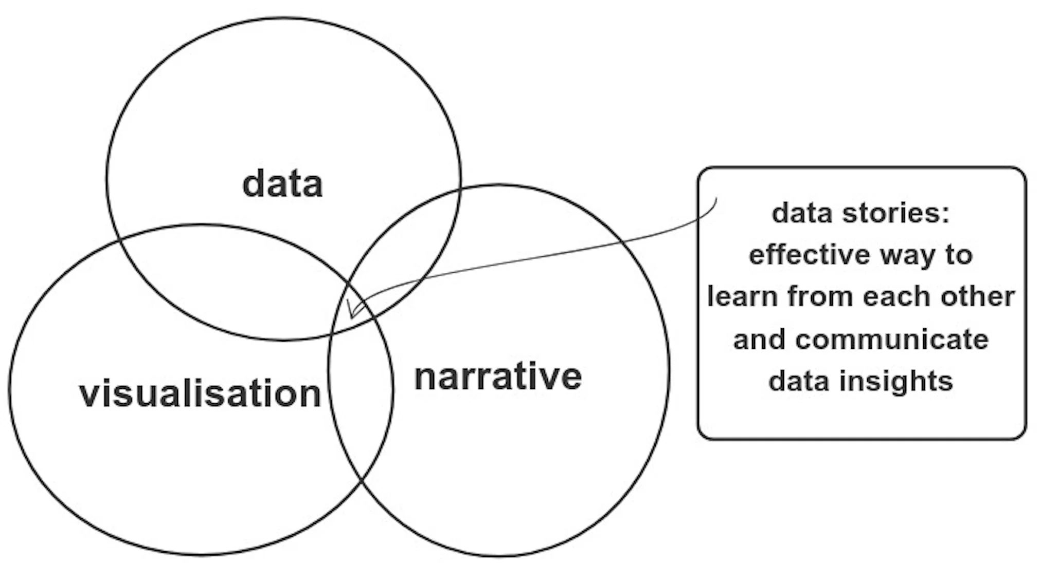
In this age of big data, this is how we are to learn from each other — telling data stories. There are three crucial fundamentals of data storytelling, data, visualisation and narrative.
#1. Collect and clean your data
Before you can tell any data stories, you need data. If you are working in an organisation, a class assignment, or a Kaggle dataset; you have the data. You have to figure out what is the story you want to tell.
If you don’t have data yet, you have to define your hypothesis before collecting data. Your hypothesis should be measurable and clear. This will guide you to find or collect suitable dataset for analysis. Try searching for an open-source dataset that might answer your key question. However, if your question is niche, you have to build your data collection system.
Before you can extract any insights from your data, you have to ensure that the data is correct. This process is defined as data cleaning. Typically you want to clean data that are incomplete, inaccurate, inconsistent and duplicated; to have accurate results.
Identify bad data
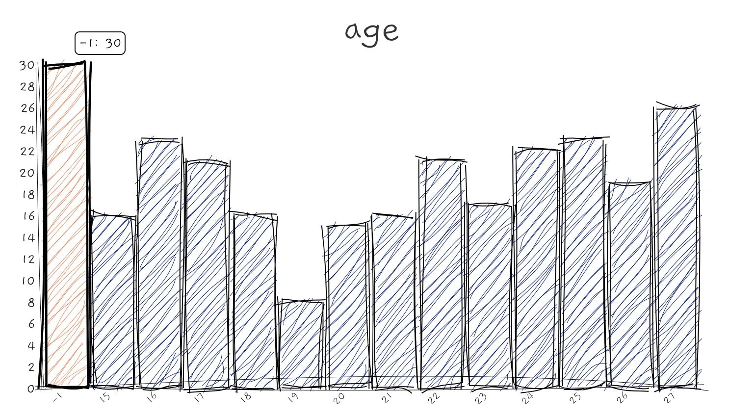
Imagine if someone spotted an error during your presentation, that will make your work less credible. For example, if you have a dataset that contains human age, it wouldn’t make sense if someone is 5,000 years old. You might have to remove them first.
Identify missing values
Missing values can be represented as empty values or values that are out of range, like “-1” or “-99” for human age. Your job is to identify and handle these missing values. You may have to get rid of columns or rows that have too many missing values.
Look for outliers
These are data points that contain values that are outside the normal range. Unlike bad data, outliers’ values are valid. For example, in the Seattle Airbnb dataset, there is 1 host who set the minimum rental nights to 1,000. It may offer interesting stories and insights, but they may also skew your results. You have to identify and decide how to deal with these kinds of data.
#2. Examine data with visualisation
This part is commonly known as exploratory data analysis, in short, EDA. Here you will ask yourself questions as you go about exploring the data you have. You will analyse features, find patterns and relationships between features.
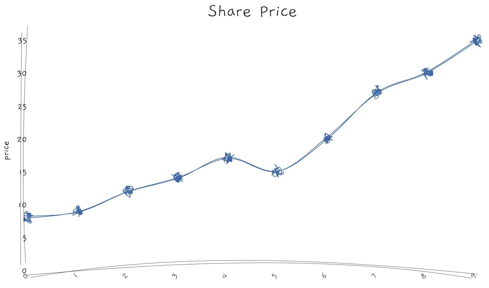
Look for trends
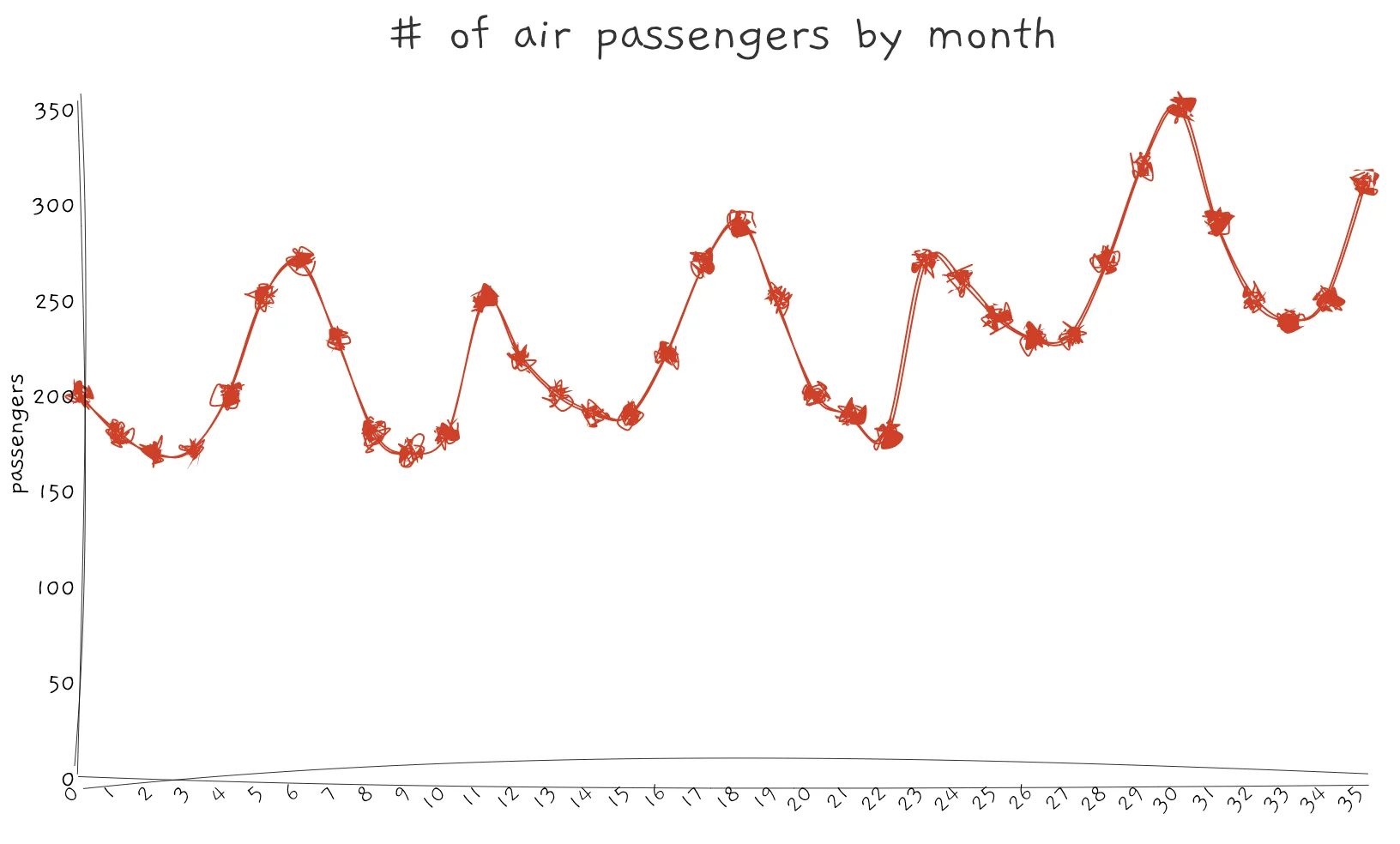
If the data you have consist of time variables, likely you will be interested in finding out if variables are increasing or decreasing over time. The easiest way to visualise trends is by plotting a line chart.
Sometimes, a feature can have a cyclical pattern. For example, the number of air travel passengers will increase during the holiday period, and the amount of rainfall in a year varies by season.
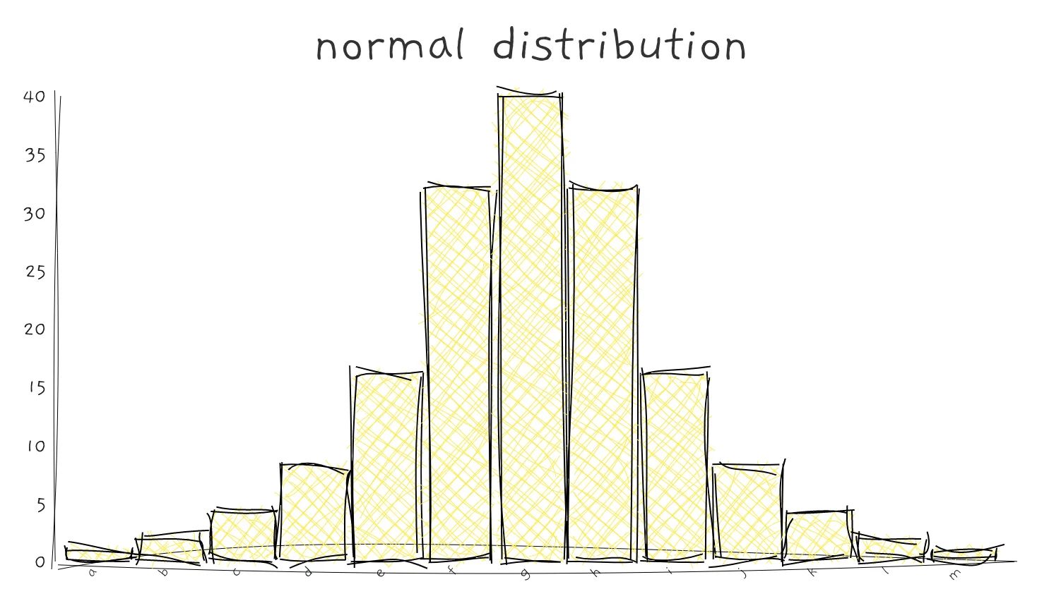
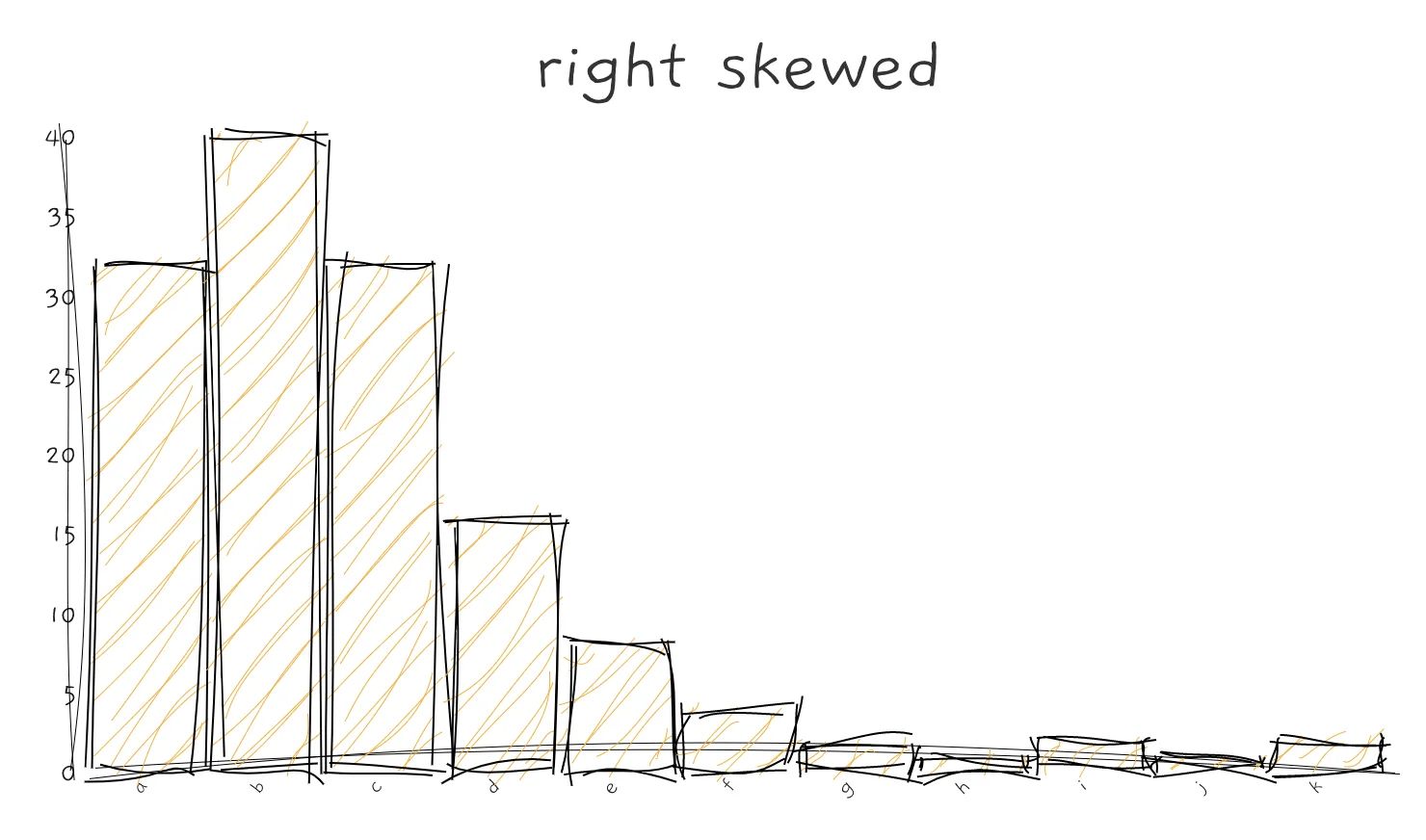
Distribution of values
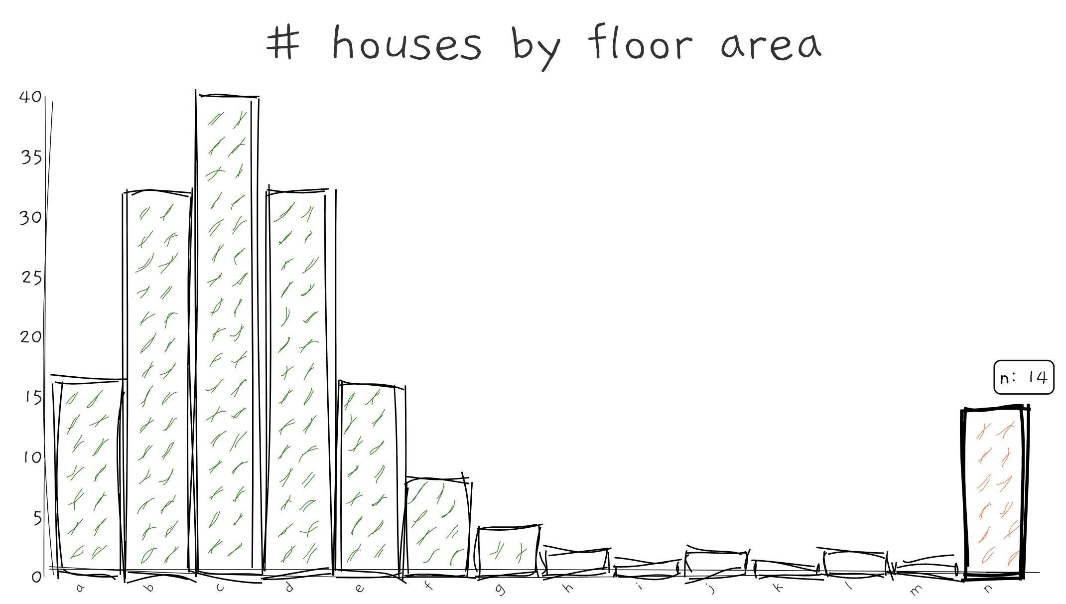
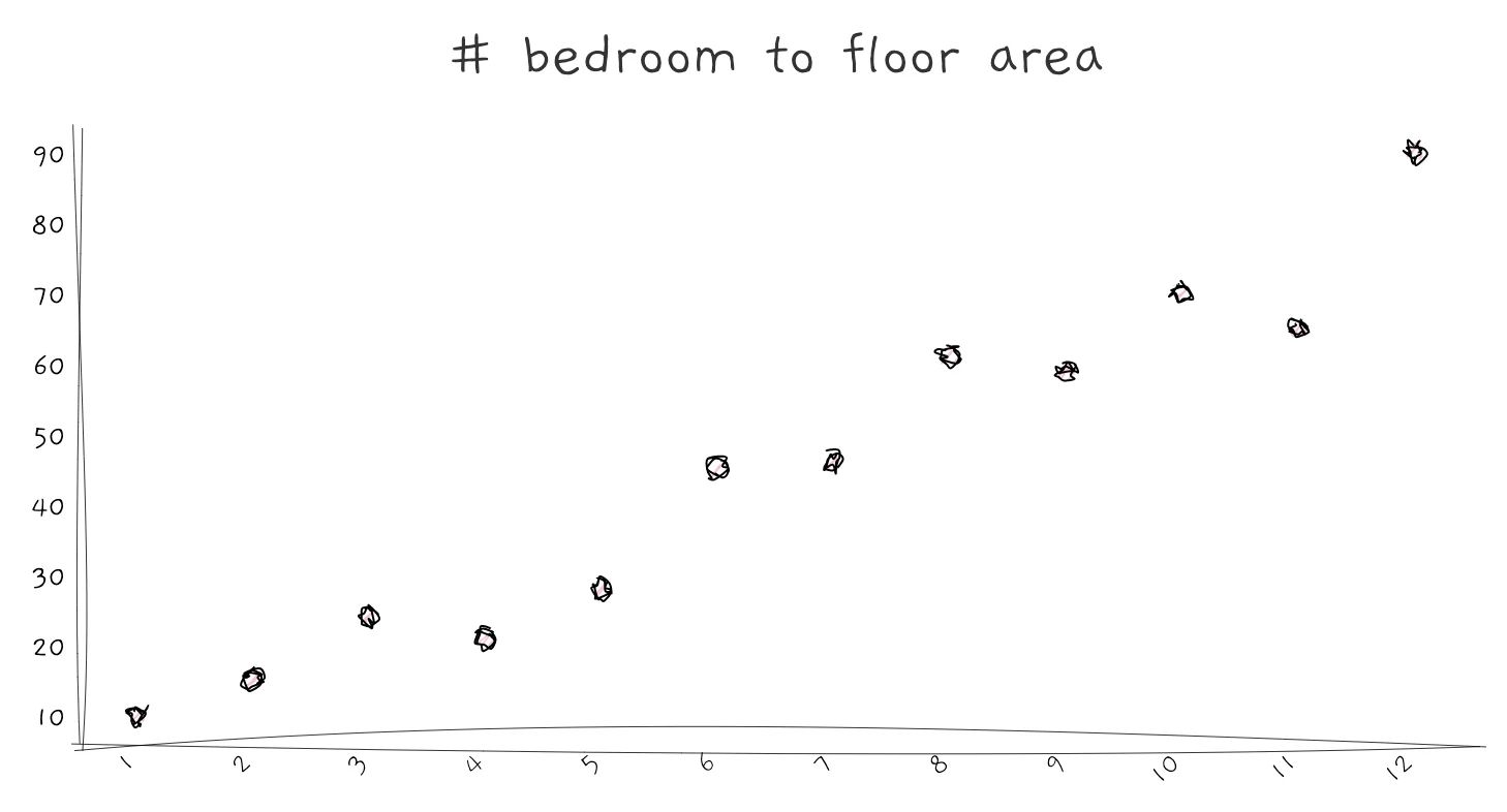
For numerical features, you may want to find the range of the variables. This enables you to know the smallest, largest, mean and median of the feature. It also informs us if the data is left or right-skewed. A common approach to display distribution is using a histogram.
A histogram can also identify anomaly data and default values. For example, you can extract those houses with humongous floor area and variables with -1 default values.
Correlation between features
Looking for a mutual relationship between two or more features is a valuable insight. It is usually interesting, and it could help your audience learn something they might not know. For example, in this study, the researchers found a positive correlation between eye diseases and sunshine duration. And that is interesting.
A useful chart to show correlation is a scatterplot. You can also add a fitted line to check if it is positively or negatively correlated.
Knowing how features correlate can help you build a better prediction model. If two features are highly correlated, you have to scrutinize it as it could be a result of duplicated data. And if a feature is highly correlated to your target label, that feature may be significant.
“A picture is worth a thousand words.” That is the common mantra but when it comes to data visualisation that thousand words may not be enough to bring insights across.
Which brings me to the next point, you need a story to convey those insights you’ve found.
#3. Communicate insights with a narrative
Useful datasets and beautiful visualisations don’t make a good data story. A data story is only compelling if it provides values to the audience. It allows them to learn something new or gives a fresh perspective to make better decisions. Or at the very least, your audience can understand what you are working.
Your narrative should guide the audience through your insights, and help them follow your flow of ideas. Using data to support your story using narrative and visualisations is particularly powerful because it increases comprehension and retention, and it is engaging.
Comprehension
Using visualisation in your stories can make your audience see the data coming to life. Our brains are wired to be better at recognising patterns and colours rather than raw numbers. Helping your audience to see the data will help them interpret it.
Retention
By combining narrative and visualisations, it helps your audience remembers your content. Doing so, you are effectively providing both the analytical and emotional experience to your audience. Cementing the information you have delivered.
Engaging
Your audience needs reasons why they should be listening to you. Using a narrative can help them associate the data shared and why it matters to them. If you can design your story for your audience to align with their interests and goals; they will be engaged in your story.
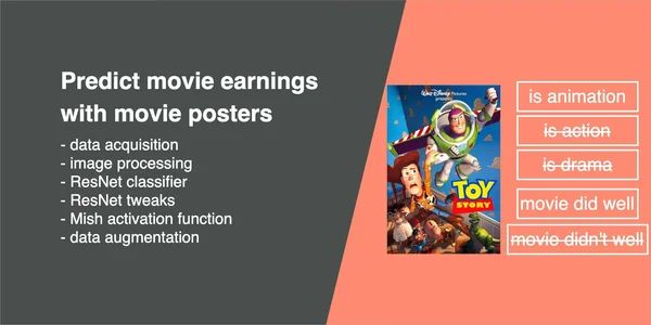
The clues to a great story
Andrew Stanton is a film director who worked on Toy Story, Finding Nemo and Monsters, Inc. He shares his discoveries of great storytelling in this TED Talk. He explains how great stories can engage the audience and how we can connect to each other’s experiences.